Jobright.ai is an AI co-pilot for job hunting. It streamlines the process of finding the perfect job, creating a tailored resume, and helping you gain an advantage by tapping into your LinkedIn network.
Let’s dive in and break down their landing page and onboarding to see what we can learn from the #1 voted product of the week on PH.
Landing Page
Right away, Jobright hits you with two things in the hero section:
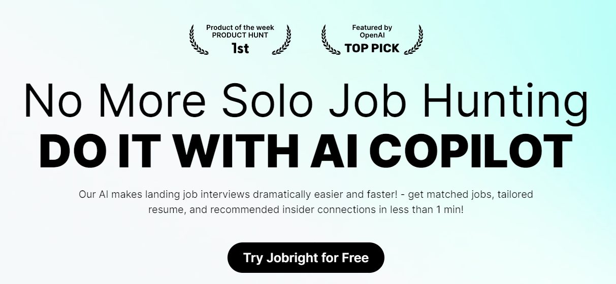
Social proof: #1 product of the week and featured by OpenAI
Punchy headline + tagline:
The headline taps into a key pain point of the target audience - the job-searching journey can be lonely. It’s also super short.
The tagline explains the benefit (landing interviews easier and faster) and the how (from matched jobs, tailored resumes to recommended connections). Two sentences. It’s short and clear.
Second, a video automatically plays when you scroll down. It’s a 33s video. All three key features are demo’d.
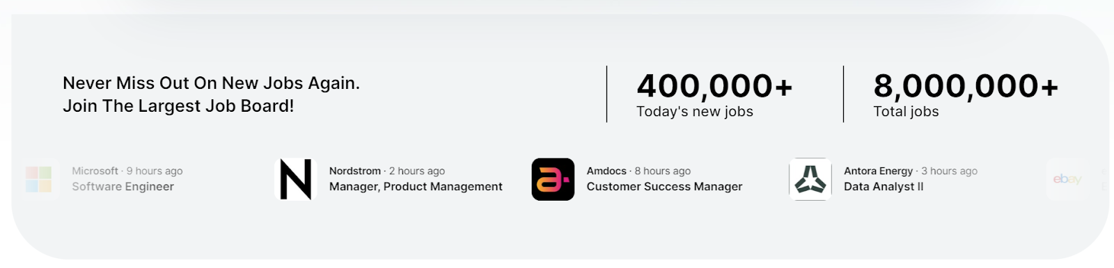
Next up, the page shows you how many jobs are in their job bank - conveys the idea that you won’t miss out. And sure enough, they have a scrolling banner of jobs below the numbers. However, it’s moving fast, and makes me a bit dizzy.
Then, you get hit by nearly two vertical scrolls’ worth of user testimonials, including a video too!
Only after everything above - gaining your trust - does the page start to go into feature details. The feature details section’s format is simple:
Header + simple tagline
Detailed bullet points
Mockup/screenshot
CTA
Honestly, the screenshot explains most of the ideas, and not many people read bullet points. So, sell with your visuals.
Next, MORE social proof. Now from the industry side - a different persona.
Then, you get an FAQ section. Shutting down even more of your rejections.
Lastly, you will see a job search component. This is interesting to me. If I see this component at the top, I’d try it before watching the video and reading the page. I don’t think I’m alone in believing that using a product is better than reading about it. But they decided to leave this most interesting piece at the bottom.
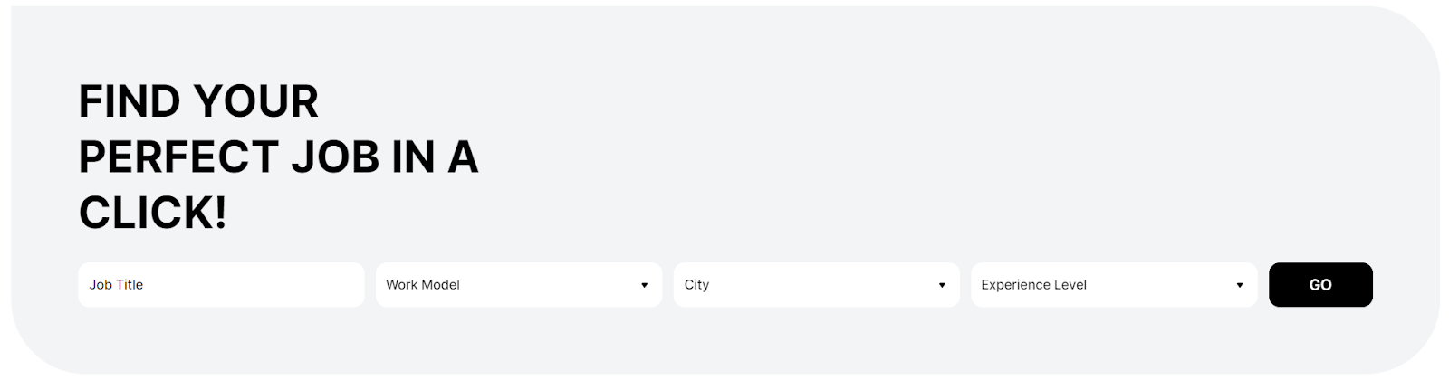
What’s more interesting is that after you search for a job, you will be taken into the unauthenticated experience. Some info is hidden because they require your information to show, such as the matching score, but a lot of info is publicly available, such as salary band. This version of the product also demos well which features CAN be unlocked once the user signs up.
The only other way for someone to get to this part of the product is by clicking one of the jobs in the scroll bar I mentioned above. This could be the reason why this job search component is pushed to the bottom. However, I’d argue that the experience is a lot better for me if I use the search bar.